What Colours Go With Blush Curtains?
Blush curtains are a stylish and versatile choice for many rooms, including living rooms, bedrooms, and nurseries. They bring a soft, elegant touch to any space. Here are some colours that pair well with blush curtains, tailored to British tastes and interior styles:
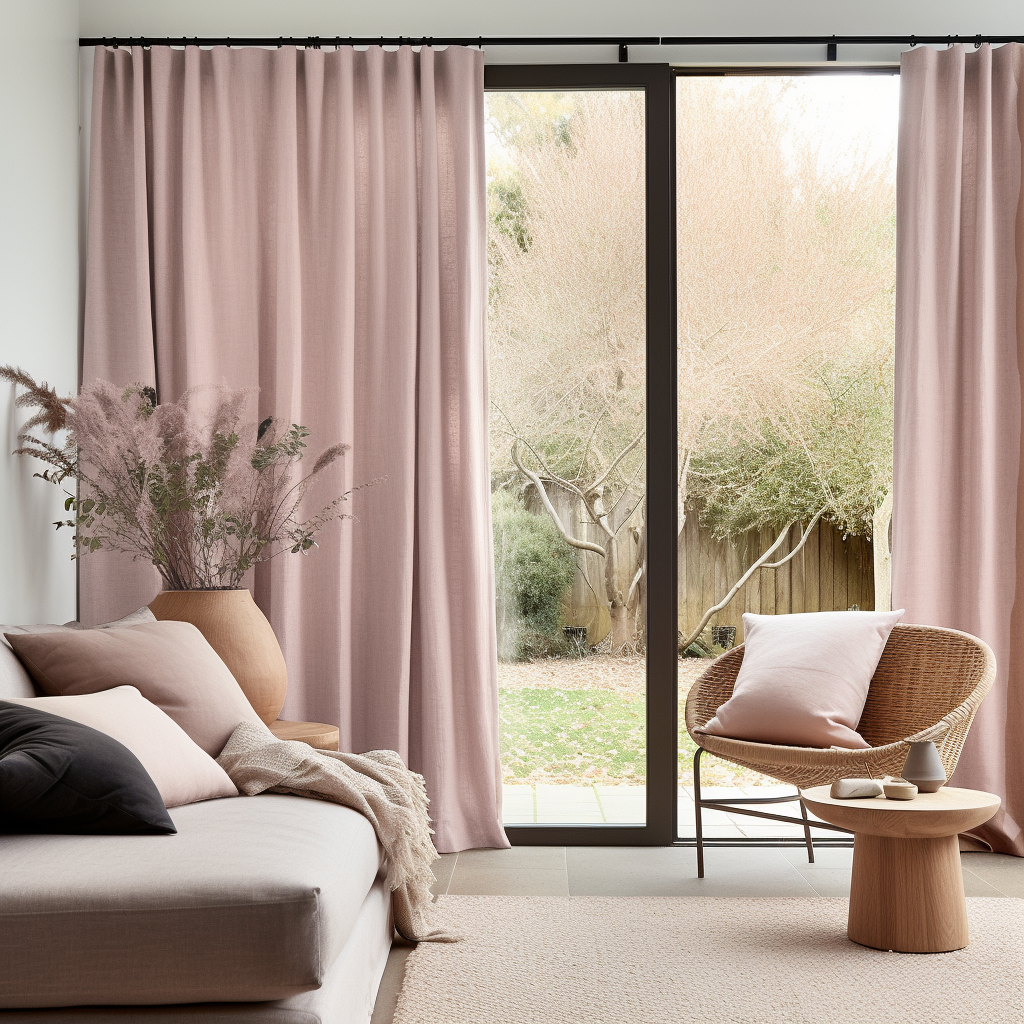
Grey
Why It Works: Grey is a neutral colour that balances the softness and style of blush, creating a sophisticated and serene atmosphere.
How to Use It: Incorporate grey through furniture, wall paint, or rugs. Light grey tones can keep the room airy, while darker greys add depth and contrast to a room when paired with pink curtains.
White
Why It Works: White complements pink curtains by enhancing their light, delicate appearance, making the bedroom feel fresh and clean.
How to Use It: Use white for walls, bedding, or trim. It can also be introduced through accessories like lamps, picture frames, or shelves.
Navy Blue
Why It Works: Navy blue in velvet fabric provides a bold contrast to blush pink, adding a touch of drama and sophistication without overpowering the room.
How to Use It: Integrate bright navy shade through accent walls, furniture, or decorative pillows. This combination works particularly well in living rooms and bedrooms.
Gold and Brass
Why It Works: Gold and brass accents add warmth and a touch of glamour, enhancing the elegance of blush curtains.
How to Use It: Incorporate gold through light fixtures, mirror frames, or decorative accessories. Brass can be used in furniture legs or handles for a subtle, luxurious feel.
Green
Why It Works: Green, especially in shades like sage or olive, brings a natural, calming effect that pairs beautifully with the soft pink tones of blush.
How to Use It: Use green in upholstery, plants, or artwork. This combination is perfect for creating a tranquil and inviting space.
Cream and Beige
Why It Works: Cream and beige are warm neutrals that blend seamlessly with blush pink, creating a cosy and cohesive look.
How to Use It: Apply these colours to wall paint, furniture, or carpets. They help to maintain a light and airy feel while complementing the pink curtains.
Black
Why It Works: Black adds a striking contrast to pink curtains, creating a modern and chic appearance without being too harsh.
How to Use It: Introduce black through small furniture pieces, picture frames, or accent items. It’s best used with pink curtains sparingly to maintain a balanced look.
Teal
Why It Works: Teal offers a vibrant, refreshing contrast to blush pink, adding depth and a pop of colour to the space.
How to Use It: Incorporate teal in cushions, rugs, or wall art along with pink curtains. This combination can make a room feel lively and stylish.
Charcoal
Why It Works: Charcoal provides a more profound, richer contrast to blush pink or pink curtains, adding a sophisticated and grounded feel to pink pencil pleat curtains.
How to Use It: Use charcoal in larger furniture pieces like sofas or headboards. It pairs well with blush pink for a modern, elegant look.
Soft Pastels
Why It Works: Other soft pastels, like mint green, lavender, or light blue, can create a delicate and harmonious colour scheme for baby pink blackout curtains or pencil pleat pink curtains.
How to Use It: Introduce these colours through bedding, wall art, or decorative accessories for a cohesive, gentle aesthetic.
Summary
Blush pink curtains are versatile and pair well with a variety of colours, from neutrals like grey, white, and beige, to bold contrasts like navy blue and black. Incorporating metallics like gold and brass can add a touch of elegance, while greens and other pastels create a soothing and harmonious environment. The key is to balance the softness of blush or pink curtains with complementary colours that enhance the overall decor of the room.


 Dusty Pink Linen Pencil Pleat Curtains - Ready-Made & Made-to-Measure - Unlined, Blackout, Thermal or Cotton Lining - Suitable for Tracks, Rings, and HooksFrom £104.00From £104.00
 Pink Velvet Pencil Pleat Curtains – Unlined or With Blackout, Thermal or Soundproof LiningFrom £69.00From £69.00
 Dusty Rose Linen Eyelet Curtain Panel – Different Grommet Colours – Unlined or With Cotton, Blackout, or Thermal LiningFrom £82.00From £82.00
 Dusty Pink Doorway Linen Curtains - Natural Indoor Door Curtains - Unlined or With Cotton, Soundproof, Blackout or Thermal Lining - Available in 24 ColoursFrom £104.00From £104.00
 Pink Velvet Back Tab Curtains – Unlined or With Blackout, Thermal or Soundproof LiningFrom £69.00From £69.00
 Dusty Rose Linen French Door Curtain Panel – Optional Blackout, Thermal or Cotton Lining – Made to MeasureFrom £33.00From £33.00
 Thermal Pink Velvet Multitape Curtains – Heavy Thermal Insulated Velvet Curtain PanelFrom £109.00From £109.00
 Dusty Pink Linen Valance - Custom Kitchen Curtains – Available in 24 Different ColoursFrom £40.00From £40.00
 Dusty Pink Linen Eyelet Curtain Panel – Different Grommet Colour – Unlined or With Cotton, Blackout, or Thermal LiningFrom £82.00From £82.00
 Pink Velvet Rod Pocket Curtains – Unlined or With Blackout, Thermal or Soundproof LiningFrom £69.00From £69.00
 Dusty Rose Linen Noren Curtain - Japanese Curtains - Noren Drapes - Door CurtainFrom £65.00From £65.00
 Pink Velvet Soundproof Curtains with Multitape Heading – Noise Cancelling & Noise Reducing DesignFrom £109.00From £109.00
 Dusty Pink Wave Linen Curtain Panel - Suitable for Rings and Hooks or Track - Unlined or With Cotton, Blackout, Soundproof/Thermal Lining - Available in 24 ColoursFrom £87.00From £87.00
 Dusty Rose Linen Pencil Pleat Curtains - Ready-Made & Made-to-Measure - Unlined, Blackout, Thermal or Cotton Lining - Suitable for Tracks, Rings, and HooksFrom £104.00From £104.00
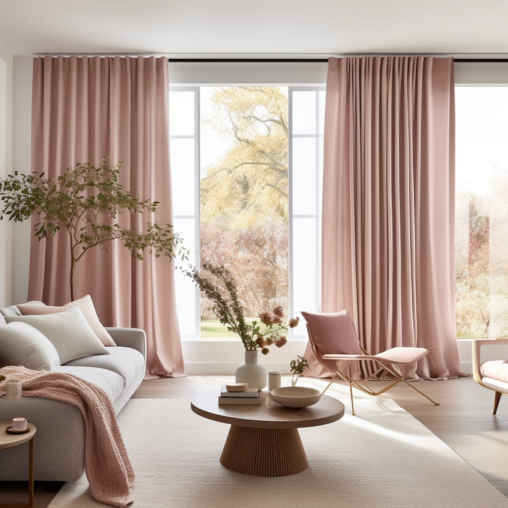
 Dusty Pink Linen Back Tab Curtain - Unlined or With Cotton, Blackout, Soundproof/Thermal Lining - Available in 24 ColoursFrom £66.88From £66.88
 Dusty Rose Linen Soundproof Curtains with Multitape Heading – Designed to Reduce Noise and Block SoundFrom £148.00From £148.00
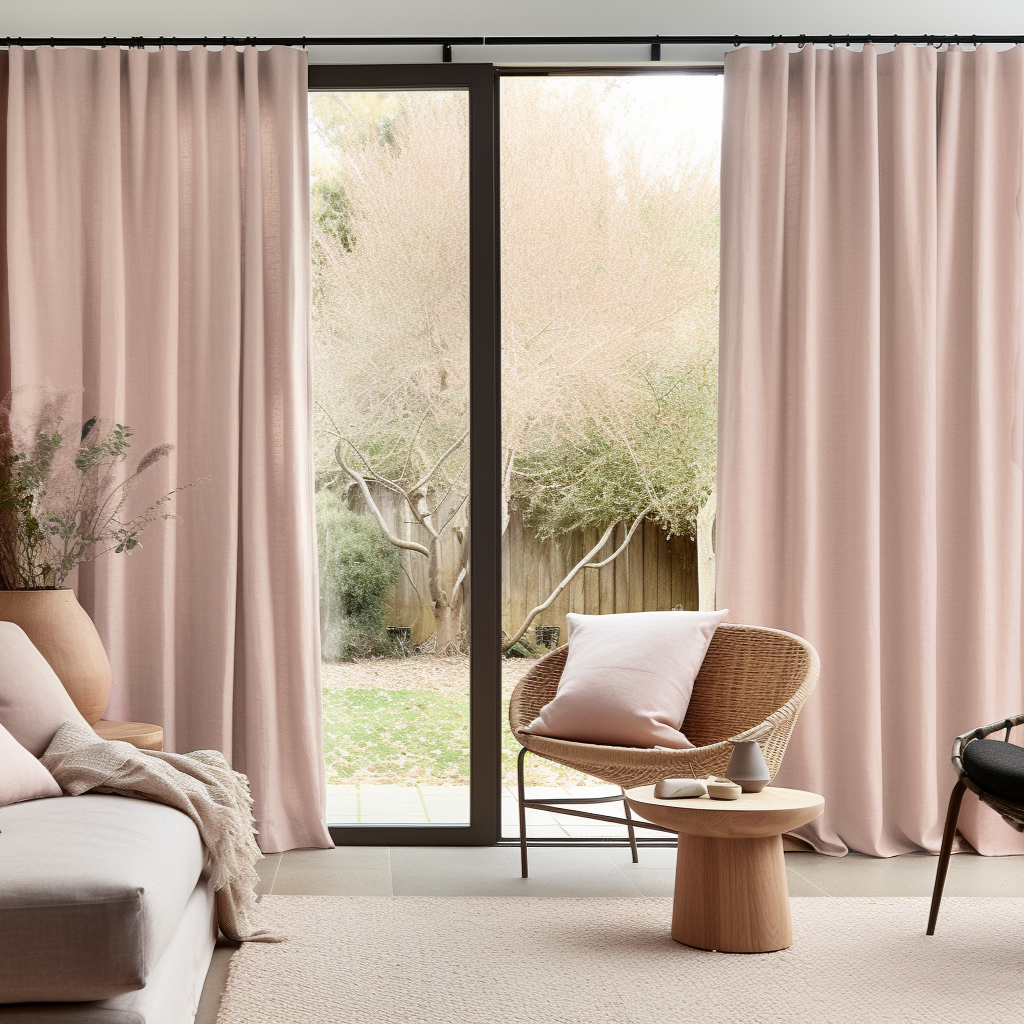
 Dusty Pink Linen S-fold Curtain with Blackout Lining - Custom Sizes & ColoursFrom £94.00From £94.00
 Dusty Rose Linen Valance - Custom Kitchen Curtains – Available in 24 Different ColoursFrom £40.00From £40.00
 Pink Velvet S-Fold Curtains – Unlined or With Blackout, Thermal or Soundproof LiningFrom £69.00From £69.00
 Dusty Pink Rod Pocket Linen Curtain Panel - Unlined or With Cotton, Blackout, Soundproof/Thermal Lining - Available in 24 ColoursFrom £104.00From £104.00
 Dusty Pink Linen Cafe Curtains – Short Tier Panel for Small Kitchen WindowFrom £36.00From £36.00
 Dusty Pink Linen Noren Curtain - Japanese Curtains - Noren Drapes - Door CurtainFrom £65.00From £65.00
 Pink Velvet Pinch Pleat Curtains – Unlined or With Blackout, Thermal or Soundproof LiningFrom £69.00From £69.00
 Dusty Pink Linen French Door Curtain Panel – Optional Blackout, Thermal or Cotton Lining – Made to MeasureFrom £33.00From £33.00
 Pink Velvet Tab Top Curtains – Unlined or With Blackout, Thermal or Soundproof LiningFrom £69.00From £69.00
 Dusty Pink Linen Soundproof Curtains with Multitape Heading – Designed to Reduce Noise and Block SoundFrom £148.00From £148.00
 Dusty Pink Linen Thermal Curtains - Custom Headings - Insulated Draft Blocking 100% Blackout & Soundproof Curtain Panel for Winter & SummerFrom £137.00From £137.00
 Pink Velvet Eyelet Curtains – Different Grommet Colours – Unlined or With Blackout, Thermal or Soundproof LiningFrom £69.00From £69.00


